Showing posts with label realism. Show all posts

Sunday, September 29, 2013

LAVENDER SHADOWS

A few years ago an opportunity made itself known to me to participate in Blanco's "Lavender Festival." A fine art show was attached to the festival and I had been invited to show my work there. The Lavender Festival is usually scheduled for the first weekend in June and is a veritable smorgasbord of lavender-based creations– pastries, candies, sachets, paintings, even wine– any and all things created, with lavender as the common ingredient.

There were crowds of folks as I showed my art that weekend, and Blanco's town square was ebullient. The show was fairly successful for me, and the pieces I displayed were enjoyed and appreciated by many, even those not buying. During a fairly quiet moment in my booth, however, an older lady scrutinized my work but said nothing for quite some time. Finally, she broke the uncomfortable silence: "Hmmmmm...I really like your work, BUT..."

I walked up to her and tried to understand her intentions: "Yes, can I help you? I heard a 'BUT.' Is there a problem?" She responded: "Yes, there IS a problem. I love your work, Bill...BUT...where are your LAVENDER PHOTOGRAPHS?"

With some trepidation, I tried to respond: "Yeah, yeah, I know...this is a 'Lavender Festival' and I have no photographs of lavender. I'd like to have some, but I've never had the opportunity to take any."

"Well, I'll tell you what...I've got a small, private lavender farm just outside of downtown. Here are the security codes to both of the gates that will let you in. Come anytime you'd like and take some photographs. You needn't stop and ask first, or even call ahead. But take some lavender photographs...PLEASE!"

LAVENDER SHADOWS, © Bill Brockmeier, all rights reserved by the artist
About a week later, I and a photographer friend who had recently moved to the Blanco area took up Alice Coverly on her more than generous offer and sought out her farm. The security codes worked as advertised and we soon found ourselves alone and surrounded by her five or so acres of lavender bushes. The light breeze was heavy with the perfume, and the shadows were already lengthening with the sun dropping toward the horizon.

The place seemed an astounding fusion of French Provence and Texas Hill Country– the smell and color of France and the vistas of the Hill Country. Perhaps South Texas is not really that far from southeastern France after all.

The next June at the following "Lavender Festival" I was again showing my work to those seeking lavender in Blanco. This time I was heavily armed with my own lavender offerings. The image you see here– LAVENDER SHADOWS (a very limited edition of only 12 on large canvas)– was made as the sun nearly kissed the horizon. Some of the lush, blooming plants had already been immersed in shadow while others were still in the blaze of sunlight.

As I have shown the two photographs from this series, many have made it plain to me that they believe the photographs are paintings. I've tried to assure them that "No, these are not paintings, but photographs." Some have remained unconvinced, and swear that I must have at least applied some little dabs of paint to some of the blooms to make them stand out and appear 3D. Although I use no digital enhancement to the colors or otherwise, they still find it difficult to believe these are simply straight photographs.

Thanks to a friend of the arts, and a lover of lavender, I was able to make some memorable images of this wonderful plant. Thank you, Alice!
_______________________________________

This photograph is available in a Very Limited Edition of only twelve copies. The full, framed size is 19 by 62 inches.    Call now to reserve yours— 210-241-6132.

Sunday, November 4, 2012

Solitude, Silence, and Stillness

About a week ago I took the opportunity to visit my Art and Conservation project site in the Texas Hill Country. If you recall my posts of the summer, I had been assigned a Nature Conservancy land trust that is located somewhere between the little towns of Sisterdale and Comfort. The trust is situated along a nearly one-mile stretch of the cold, clear Guadalupe River.  This was my first chance to return in a couple of months and I was looking forward to spending nearly a full day there: capturing images and getting to know the place.

I had called and left a message with the landowners informing them of my trip out there. Since they hadn't responded within a day of my phone-call  I didn't expect them to be there, and they weren't. I would have this huge natural gem to myself– I almost felt guilty about it.

I had arrived a couple of hours after dawn. Even though it was well into morning, the fairly high bluff on the southeast bank of the river was still deep in shade and the day seemed younger than it was. The air was crisp and new. 

I drove my truck slowly over the nearly invisible trail on the precipice above the silt plane adjacent to the river. The bank on this side was already well lit by the sun. The sun's beams had not yet illuminated the river itself, still a hundred or more yards away, but I imagined I could see ripples sparkling on its surface. I parked and exited my truck, attempting to close my door without breaking the silence that surrounded me. The only sound I could now hear was the whispering babble of the river in the distance, but perhaps I imagined that as well. 

CYPRESS LANE, © Bill Brockmeier, 2012
All rights reserved by the artist
It is really remarkable when you finally find yourself in a place where silence reigns. No street traffic, no humming AC units, no TVs inanely yakking in the distance...not even an aircraft in the clear blue overhead. It is amazing how the immediacy of life comes to the fore when there are no external sounds to distract you. All of a sudden you feel your own heart beating in your own chest. You can feel/hear the rushing "whoosh" of your blood as it streams through the capillaries of your inner ears. And then you start to "hear" your own thoughts. They become so clearly audible that you'd swear you were speaking them, but then you realize that your lips and tongue are not moving and your mouth is still closed. 

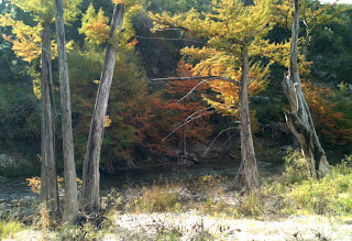
The lack of external sound can also amplify the sense of vision. Magnificent, large cypresses lined the river in front of me and their deep green leaves were brilliantly backlit in front of the yet-dark bluff behind them. Even though a hundred yards off, it seemed I was seeing the finely cut "needles" in perfect clarity and in higher resolution than my eyes were physically capable of. 

COLOR IN THE SHADOWS, © Bill Brockmeier, 2012
All rights reserved by the artist.
I headed down to the river itself after taking a few exploratory photographs from afar. Now at the immediate banks of the Guadalupe I could hear the actual sound of it. The audible sensation of running water is something exquisitely marvelous and magical. I don't believe I could ever tire of it. The hearing of it is, to me, as refreshing and enlivening as taking a long, slow drink of it. My ears drink in the sound of it. 

I continued to photograph throughout the day, moving freely through the conservancy trust. It was not only the lack of man-made sound distractions, but also the total absence of any human contact for seven or eight hours that was refreshing and invigorating. It is marvelously cleansing to be immersed in nothing but the Creator's handiwork. And when you come so face-to-face with His Art, it makes communication with Him that much more immediate and powerful.

Personally, I take great joy in talking with people about my own creative work– hearing what they think and feel about it, and giving them my insight into how the work came about and what it means to me. I believe it is the same with the original and authentic Creator– He, and we, can take great joy in conversing about His work as we experience and consider it. And He will give us insight into how this creation came about and what it ultimately means.

Tuesday, September 11, 2012

Another Dimension

In the physical universe there are multiple spatial dimensions: three translational and three rotational, as we have seen. But there is also a single dimension of time. It is this time component that is of paramount concern to the photographer. Once all of the geometric choices have been have been made (the translational "where" and rotational "what") there is still one more dimension of choice to be made– the "when."

MORNING GUARD
© Bill Brockmeier, 2012
Once a specific shot has been completely set up in a geometric sense– the camera is attached to a tripod, then aimed and locked in a specific direction and orientation, and the focal length selected– the specific, unique image is still waiting to be determined. What will actually constitute that image will only be revealed as time unfolds, and at some specific instant a choice is made by the photographer to release the shutter and record the photograph. At that singularity the moment crystallizes and the photograph is born. The image now has creative life. Once having existence only as objects in the physical universe and ideas within the mind of the artist, these two combine in a mysterious transformation and transition from a fleeting existence in the physical realm to a more enduring existence in the photographic universe.

All around us the flow of time streams on, inhibited by nothing. All in the physical universe is moving, changing, living, dying. Nothing remains as it was. A rock, half buried in the surface of the earth, seems to be inert and unchanged by the years. And yet it is part of this globe that spins on its axis at a thousand miles per hour, and revolves around its parent star at sixty times that speed, and through this galaxy at who knows how fast. And given enough time on a geological scale it will erode away by wind and water and chemistry, carried into the planet's oceans, deposited on the sea floor, and possibly carried downward into the hot interior of the earth to be melted once again.
PARADE REST
© Bill Brockmeier, 2012

But the photograph lives outside of the physical universe that gave it birth. This extra-physical existence is now outside of time and outside of the movement of time that changes everything. This is an absolutely different kind of existence. Even if the photograph itself, the printed form, degrades, erodes, and fades away, the photograph itself– the crystallized vision of the artist– remains the same. Though derived from material existence and objects, the photograph has a fundamentally different type of existence.

One can have a camera on a tripod, locked in a specific direction, with the focal length fixed, and take a virtually limitless set of different images. As the sun rises in the morning, arcs across the zenith, and settles below the western horizon, this single day alone can provide a wealth of diverse photographic ideas. As the seasons change– fall, winter, spring, summer– what is seen by the camera is continually growing, moving, morphing. And as the decades and centuries and millennia fly by the view continues to change, evolving from what was to what is and ultimately to what will be.

And all the while the photographer is there, waiting. Waiting to grab the moment that will become his art, his image.

Wednesday, September 5, 2012

High Yield Crop

Once the location of a photographic shot has been chosen (the center of perspective), and the direction and orientation of the camera has been selected (the center of the perception), there is yet one more significant geometric choice of editing to be made. After choosing the place from which to observe and also the direction to look toward, there is still most of the universe to see. The action of what has come to be called cropping a shot will further limit the scope of the view to the final image (this is another segment of the "what?" editing dimension).

There are actually two components to the crop. The first occurs in the camera. The selection of the lens focal length is actually a cropping action. The longer the focal length (this tends toward telescopic or "telephoto") the narrower the camera's field of view, and thus, the smaller the piece of the universe that the camera can see. As the focal length is shortened, the wider the camera's field of view becomes, and the larger the piece of the universe it can see.

THIS LITTLE LIGHT,
crop A,
© 2012, Bill Brockmeier
THIS LITTLE LIGHT,
crop B,
© 2012, Bill Brockmeier
Once a photograph has been recorded by a camera, there is a final cropping action that can yet take place. Before or during the printing, or otherwise displaying of the final photographic image, the frame can be further cropped. Although the field of view of the image can no longer be made wider it can be made smaller and the orientation even rotated somewhat.

The two photographs I have shown here demonstrate the dramatic difference a slight crop at printing can make in an image. Both images were derived from the same original full panoramic photograph, and both have exactly the same size and aspect ratio (height to width ratio). The first crop (on the left here) reveals more of the immediate objects at hand near the original observer, including the floor on which one would be standing. This gives an immediate connection with what the environment was like in the location, and puts the viewer of the photograph back at the scene.

The second crop (on the right) tends to extract the viewer of the photograph from the original location and brings more of a thoughtful, abstract quality to the image. The overall effect of the image is to cause the viewer to raise their vision upward, from the little light below to the more celestial bluish light that illuminates the upper portion of the image. The objects in the image are now all unconnected to the floor upon which the viewer would be standing and moves the viewer's thoughts from down here below to up above. While the depth of the former image was very much locked within the original location, the depth of the latter image is definitely moved beyond the simple physical reality of the original space. This second crop, although derived from exactly the same image as the first becomes an entirely different photograph.

These cropping edits at both ends of the photographic process cannot alter the geometric relationships between objects within the view, but its main function is to select or limit which features reside in the image. The narrower the image is cropped, the more the image reveals the details and subtleties of the remaining objects. The wider the image's view (the less it is cropped), the more the objects are shown in relationship to their surroundings.

Cropping is also a way of eliminating distracting or irrelevant features from the image. The more that objects are cropped from view, the less the remainder is connected to its environment, and the more abstract it tends to become.  The less that is left in an image, the less distractions there are, and the more opportunity there is for the viewer to think on what remains– and to think on what is not visible to the eye.

Next stop in editing— the Time Zone. 

Thursday, August 16, 2012

Center of the Universe


I wrote previously that editing is one of the fundamental tools, maybe THE fundamental tool, of photography. The photographer starts with an external, previously created universe and then begins a process of decisions culminating in either inclusion or exclusion of various components of that reality. These decisions can be incredibly detailed and complex, but for the most part they tend to fall into three primary dimensions of choice.

Often the first dimension of decision that a photographer makes is one that I would call the point of perspective, or the point of view, or maybe the center of the photograph's universe. This has to do with the photographer's location, or more precisely, the location of the center of the camera's entrance pupil.

It has been said that "the eyes are the windows of the soul," and similarly, you can think of the entrance pupil of the camera as the window of the "soul of the photograph." If you look into the front of a camera's lens, you will see a dark hole right in the middle– the entrance pupil– the gate through which all light that ends up producing the photograph is channeled. And for the photographer, the camera's pupil becomes an extension of his own anatomical pupil. In this article, I will use the two interchangeably: the photographer's own pupil, and the entrance pupil of the camera.

When you open your eyes and look out into the universe, in a sense, you are at the geometric center of everything you perceive. For better or for worse, you ARE the center of your own perceptions. Your perception of the universe is limited by your own location. The way everything looks to you is based upon where you stand– your location in space. The visual relationship of various objects outside of you is a function not only of their geometric relationship to each other in space, but even more so of your geometric relationship to them.

Center of Perspective
at first location
(three poles aligned)
© Bill Brockmeier


Center of Perspective
farther to the right
© Bill Brockmeier
Center of Perspective
slightly to the right
© Bill Brockmeier
The phenomenon of parallax is the prime example of this principle. If three objects are aligned with each other, and you view them directly from the front, the one in front and the one in back appears neither to the right nor to the left of the one in between ("first location" in photo above). But if you move off to the right of them, the one in front now appears to be to the left of the middle one (tall white pole), and the rear (crossing sign) appears to the right.  And if you move even farther to the right, they appear separated even more. Although the three objects appear to be moving in relationship with one another, they are actually fixed in space– it is your own motion which has caused the apparent motion of the objects.

Center of Perspective
at street level
Center of Perspective
three floors above street level
How things appear is largely based upon where you stand– what your point of perspective is. And it is the same with a photograph. How things appear in the photograph is largely based upon where the camera (and most importantly, its entrance pupil) is located.


The apparent geometric relationships of the objects in a photograph are formed and then secured by the location that the photographer chooses for the camera. And this location not only affects where they seem to be in respect to each other, but their relative sizes as well. It should be obvious that the closer the camera is to an object the larger it appears, and vice versa.

So, where the photographer chooses to set up his camera is the first decision of editing that must be made. This will drive a stake in the universe at the center of perspective for the image. The infinitude of other possibilities for the arrangement of objects in the universe has been excluded, and this singular point in space now begins to define the potential image.

Two other dimensions of editing will be explored in following articles...

Saturday, August 4, 2012

A Ferment

We just returned from a whirlwind trip to New York City. The opportunity to stay in an apartment in Midtown Manhattan was just too tempting to pass up. While there, we took the liberty to experience some of the unique possibilities only available in this City Of All Cities.

If I could describe our time there in just a few words, the first things that pop into my mind are very sensory-based: rusty, noisy, filthy, stinky. If you have a soft spot in your heart for NYC you might be offended by this estimation, and I apologize if I have touched a nerve. My point here is not to offend, but simply to report my honest human perception of the place.

Peeling Paint in 53rd Street Station
© 2012, Bill Brockmeier
But this is clearly not all of what the city holds. If that were the case, it would not be possible for a landlord to rent out a fifth-floor, walk-up, single bedroom, spartanly appointed flat of only 360 square feet for a few thousand dollars per month (as is the case for the apartment we called our home-base for four days). There are literally millions, maybe tens of millions or even hundreds of millions, of people who would love for the chance to live in this city. There must be something more here than the visceral description I used above.

I was amazed at the incongruity that seemed to present itself around every turn. Walking along a street in Midtown, we passed under an overhead bridge that was constructed who-knows-when, and covered in thick rust that was busily exfoliating onto the street and sidewalks and pedestrians below. Talk about infrastructure that needs more than a face-lift! And just turning the corner we would be treated to the astounding sculptural sight of an architectural wonder rising majestically high above us.

Then, we used the extensive subway system to make our way to a new location in the city and were frequently treated to a barrage of olfactory overloads. Though the puddles of urine and deposits of feces were invisible to the eyes, they were plainly "visible" to the nose! After arriving at our stop, we hurriedly walked up the stairs to the street above, while a finely appointed young woman rushed down the stairs next to us, trailing in her wake wisps of the incredible fragrance of the lavish perfume she was wearing.

One World Trade Center Under Construction
© 2012, Bill Brockmeier
These contrasts were jarring and continual. Living far out in the Texas Hill Country had not adequately prepared me for the roller-coaster ride of the senses that awaited me in Manhattan.

All of this reminds me of something that my Dad said to me not long ago. I was having lunch with him and my Mom and as we sat down to eat he said "Would you like some of this cheese? It's pretty good!" I asked what it was and he said that it was a really nice Liederkranz, similar in some respects to the German Limburger. I respectfully declined, and he said to me "Ohhhh, just get beyond the fragrance of it, and the taste is just wonderful!" He finally talked me into it, yet even after tasting it, the smell was still too much for me. But he sure was enjoying it.

I recently finished writing an extensive essay titled "God of the Compost" which features the bewildering ways that decay, rot, and decomposition can ultimately give rise to a host of marvelous products. Probably the single best word to use for these sorts of highly useful processes is "fermentation." I think this is at least part of what is at work in New York City, and why so many are willing to put up with the assault on their sensitivities. The smell of decay is certainly not appealing, but the resulting mature wine can be a feast for the palate!

________________________________________________

Note: if there is enough interest in the essay I mentioned above (please leave a comment here) I may publish it somewhere on this blog...Thanks!

Wednesday, April 18, 2012

A Knife That Cannot Cut

A knife, that cuts, is a valuable and appreciated practical implement, and has been for millennia. A knife that cuts, and cuts extremely well, is treasured as a craft taken to the level of art. And a knife that isn't even useful for the purpose of cutting, but has been totally infused and transformed by pure imagination, can become sought after as a royal treasure and symbol of sheer power and authority.

Business end of Karamojong
spear (about 6 inches)
A friend and I were recently discussing the interrelationship between functionalism and art. I was describing for him some African weapons I possess– a nine-foot spear in particular– that are so beautifully and expertly made, with so little resources available, that they are surely wondrous examples of functional art. The function of these weapons (to intimidate and to kill) has so directed their design and fabrication that a spare and elegant aesthetic has floated to their surface.

The combination of dark steel head and tail (glinting with silver highlights where worn and polished), with amber wooden shaft and hard rawhide edge sheath is a study in contrasting materials. The tapering steel tail is perfectly balanced visually with the curving razor edges of the point. And the art to be appreciated in this spear is not visual only.
Joinery of hand-forged steel
socket and wooden shaft, secured
with hot-melt animal glue

The heft of the spear's mass is satisfying but surprisingly light. The balance is exceptional as gripping the wooden shaft in its center so verifies. The feel of the wooden shaft is incredibly smooth, yet it is hard to imagine it slipping out of the hand, as the diameter perfectly suits the encircling fingers and palm. Shaking the spear activates the weapon system's substantial flexibility and toughness. This is a sculptural work of the highest order. And it can defend and disseminate justice to boot.

North American scraping knife
and simple arrow point,
(circa 18-19th century?)
This kind of art sprouts out of the ground of necessity, but when taken to its final conclusion becomes art of yet another level. I spoke to my friend about another colleague who had become enthralled with amateur archeology. Along the way, he began learning the art of flint knapping– the skill of percussively flaking and shaping a chunk of hard, brittle stone into a useful, sharp-edged tool. This is the craft utilized in the making of stone arrowheads. I once borrowed from him some magazines devoted to the modern revival of this art. On the cover of one of these journals was the photograph of something the likes of which I had not only never seen before, but never even imagined was possible.

A gentleman was holding up a large (10-12 inches long) stone object that apparently had been recently made by himself. As I looked at it closely, it was clear that the object had been made by some flint-knapping technique. But, Oh, WHAT technique! <<Note: I have searched for a photo of this creation but come up empty, so it is not represented here.>>

"Tiny" piece of the Mandlebrot
fractal set
The stone piece was some kind of "knife," but I use the term "knife" with definite reservation, as this "knife" could never be used to actually cut something. Instead of a smooth, continuous and gently curving blade, there was a "blade" that had been totally interrupted by curves within curves within curves. The "edge" had the overall effect of something akin to the Mandelbrot "fractal" set. The detail and complexity of the edge alone nearly took my breath away. And how could something like this possibly be made by the difficult-to-control process of breaking rocks? It seemed close to impossible for a human being to actually make something like this– let alone conceive it in the first place.

Some years after seeing this astounding piece of art, I came across what was probably the inspiration for such a work. There are many (dozens, maybe hundreds) of examples of Mayan archeological artifacts that have been referred to as "eccentric flints." These objects are knife-like flint-knapped ornaments (I hesitate to call them tools) that almost defie description. Many of them possess the same doubly (or even triply) detailed edges like a fractal pattern. One of the most interesting I have come across is in the possession of the Dallas Museum of Art.

Eccentric flint: sacred blade (tok')
CROCODILE CANOE WITH PASSENGERS, eccentric flint
© Dallas Museum of Art
This piece is referred to as "Crocodile Canoe With Passengers." The work displays a known Mayan creation myth wherein the first beings ride into existence in a canoe formed from a crocodile-god (presumably, the Milky Way). Knowing some of the highly skilled processes necessary, I cannot even imagine how the artist first approached the creation of this piece centuries ago. And how many attempts were either fatally flawed or even totally destroyed before completing the example the Museum now has? What kind of high-flying imagination and optimism did it take to think that such a thing was even possible?

This kind of art has totally transcended any notion of functionalism. These flints were most probably prized by kings and priests as representative and declarative of their positions of power. These were treasures no longer useful for the practical purpose of cutting something, but instead, were so highly valued simply because they were so rare, so beautiful, and so improbable. The extraordinary difficulty of making such a piece guaranteed that it possessed some power of its own, and perhaps could even bestow some of that power upon its owner.

This brings us back to a central question of "why art?" Perhaps part of our appreciation of and desire to own art is that we, too, desire to somehow have "rub off" on us the power of the art that we so admire– that somehow the beauty and attraction of art can become our own personal attributes as well.

Sunday, December 11, 2011

Photographic Purity– (Distortion By Intent)


The whole idea of producing a precisely rectangular  image of a known rectangle in the real world is suspect, and actually a distortion of reality. I say this because a rectangular object cannot truly appear as precisely rectangular.

At first blush this sounds counter-intuitive. You might say: "Of course rectangular objects look rectangular- what else would they look like?!" But do they? Under most circumstances, rectangular objects appear mostly rectangular, but widen the view that a rectangular object encompasses, and the picture becomes clearer.

Imagine that you are standing in front of a very large one story building- let's say that it is 10 feet high, 200 feet wide, and you are 20 feet away from it. The left end of the building stretches way off to the left, and the right end to the right. Those ends of the building appear very small, while the middle of the building right in front of you appears quite large. How then, can the front of the building appear as a rectangle?

In fact, the top of the building and the bottom of the building must actually appear as curved edges, with the two curves farthest apart in the middle, and closer together at the two distant ends. This is a simple consequence of the fact that closer objects appear larger and distant objects appear smaller. For a rectangular object centered on the direct axis of view, this causes all sides of the rectangle to appear slightly bulged out away from the center.

While this scenario is certainly an extreme example, it is still true for all other situations, just to a lesser degree. This is the effect that the built-in distortion in a camera lens attempts to mitigate. This lens design tries to force the object to actually be imaged as a rectangle, when, as we've already seen, it can't really look that way.

For the most part, this purposeful distortion in a camera lens is actually a benefit (why else would lens designers go to such great lengths to design them this way?). But when attempting to reconstruct a panoramic image from separate camera images this built-in distortion makes the effort problematic. I'll look at this issue in my next post.

Image by camera lens with built-in distortion to
produce precisely rectangular shape
View of rectangular object as it might actually
appear as a consequence of geometry


Saturday, December 3, 2011

Photographic Purity– (Geometric Distortion)

Another question that occasionally comes up when people are viewing my art at shows revolves around something they usually refer to as "distortion." The question commonly sounds like this: "I thought that panoramic photos were usually distorted, but these don't look distorted," or: "Is that hill really there, or is that just distortion?" I believe that what they are concerned about is whether or not the photograph looks something like what they would have seen if they had been standing there as I took the photograph.
SEA OF COREOPSIS, © Bill Brockmeier, all rights reserved
The answer to these questions is not a simple one. Much of the problem in answering them stems from the fact that the basis of photography is the attempt to map visible features in the three-dimensional real world onto a finite area, two-dimensional plane. While that may sound simple enough to the uninitiated, it is actually a very complex geometric and human perceptual problem. There is not a single way do to this mapping, but probably dozens of ways, with each method having its own merits and short-comings.

I won't bore you with the details of these dozens of methods, but many of them were devised over the past few centuries as the globe became circumnavigated and every far-flung corner of it became a goal of human exploration. At that time, it became important to be able to precisely represent this three-dimensional sphere we call "earth" on a flat piece of paper, so it could be easily rolled up and carried in a captain's quarters on a ship, or in the saddlebag of a horse-borne explorer. The profession of a cartographer was an incredibly demanding and important job.

When photography came along, this ability to conflate a three-D world down onto a simple two-D representation became an incredibly "easy" transformation to accomplish– automatic, in fact. The photographer didn't even have to think about it, the camera just "did it." But what determined the actual geometric transformation was hidden in the details of the optical system: the precise optical makeup of the lens system and the geometric relationship of the lens to the photosensitive plate (and its shape).

The devising and engineering of optical/lens systems has been a rich field of innovation for the past century and a half. Some of the world's brightest technical minds have been devoted to this pursuit. Their efforts at devising new lens systems have been aimed at things like sharper image focus (better detail), improved light-gathering ability, and decreased geometric distortion– whatever that means.

Lens designers have a very limited definition of what "geometric distortion" (or "image distortion") means. I won't go into what that specific definition is here, but it has very limited significance for most of the photographs that most people take. For instance, if one was trying to exactly reproduce the type on a printed, flat sheet of paper, this narrow view of distortion might be important. But if someone's portrait, or a distant landscape are more likely the subject, it's not clear that this "distortion" is an important consideration.

Most people don't know, and even most photographers don't realize, that most photographic lenses are actually designed with a certain distortion built in. It's easy to demonstrate this with almost any camera, and the more "wide angle" that a lens is, the easier it is to see.

Look through a camera's viewfinder, or at its digital display, and look carefully at some scene before you. Then, start panning the camera to the right. As the camera is in motion you will notice that objects in view will change their shape and size somewhat as they move from the right edge of the frame, to the center, and finally to the left edge. The real objects are obviously NOT changing in shape just because the camera is moving, rather, their image is different because it is passing through the lens in a different direction, thus revealing the lens's built-in distortion.

In both of the photographs below, the camera was placed at a point precisely perpendicular out from the center of the clock. The only difference in the two photos is that in one of them the clock was placed at the right edge of the camera's field-of-view, in the other it was at the left. Notice how the square of tiles immediately surrounding the clock is not square but trapezoidal in nature, and that in one of them the top and bottom lines converge to the left and in the other they converge to the right— their shape has changed. Remember that the location of the camera for each photograph was identical, and that only its direction changed.

clock at right edge of camera's field-of-view
clock at left edge of camera's field-of-view
This distortion is a by-product of the lens designer's determination that if the photographer is taking a photograph of something that is known to most people to be rectangular in nature (and that is fairly far away, and exactly centered on the camera's optical axis, and precisely perpendicular to that axis), the final photographic print should also display a precisely rectangular feature. Although that sounds reasonable enough, this is definitely a distortion of the truth, and, in fact, rectangular objects cannot really appear precisely rectangular, even if the restrictions noted above are followed.

I'll leave the proof of this final assertion for my next entry.

Sunday, November 13, 2011

Photographic Purity– (B&W vs Color)

In my previous post I mentioned that the basis for photography was producing "an analog of what the original subject 'looked like.'" That thought was a kind of off-the-cuff remark, but thinking about it again, I believe it now even more strongly. It is significant that a photograph is aimed not at simply reproducing a physical duplicate of the original, but, rather, in producing (or re-producing) a human perception ("...looked like"). The photographer may be interested in reproducing/conveying whatever her own human perception was of the subject at the time, or she may be interested in producing a particular and wholly new internal perception in the mind of the photograph's viewer (or both).

I believe this matter sets photography apart as an art, rather than as simply a science. There certainly is a place for photography's use as something closer to a science when it is used more simply as a documentary device. In my own work as an optical engineer, I sometimes use photography to purely document the external surface state of a material sample after it has been exposed to laser radiation. And its use in medical and forensic science to document both simple and complex systems and circumstances is invaluable. Even photo-journalism uses something of this documentary power of photography, but in this case, it is equally used to form a perception in the viewer and persuade.

When photography began, it's aim was an image that was composed of light and dark areas, to represent the light and dark areas that were seen in the original subject. This light/dark nature lacked any reference to the original colors in the subject– it was what we now call B/W ("black and white") photography. In this infancy of photography there was not much thought given to what the original colors might have been. At that time the only pigment available on the photographic artist's pallet was a single, simple stick of charcoal. Colors were not what mattered; only values mattered. These early innovators of photography probably never even imagined that photography would someday capture colors as well as values.

Today, there are very few people alive who can remember a time when there were only B/W photographs. And the days of choosing between an inexpensive B/W television and an expensive color unit are decades in the past. In this day, B/W photography is seen as sort of an avant-garde artistic technique, rather than the primitive progenitor of modern photography. B/W is now seen more often than not for its substantial artistic possibilities rather than as an older and cheaper form of photography. This is a good thing.

EARTH AND WATER, INTERWOVEN I, © Bill Brockmeier, all rights reserved
The considerable benefits that monochrome photography brings to the art are wide in spectrum and deep in subtlety– far too great to exhaust in this short article. However, I must at least mention its unique ability to bring the form and structure of an image's composition into clear focus. In some respect, it can offer also distinct abstract qualities to an image, somewhat distancing the observer from the original scene, and thereby bringing them into a closer interaction with their own (or the photographer's) thoughts, impressions, and emotions about the image.

With only tonal values present in the image, color can no longer distract the viewer from the image's underlying structure. This monochromatic vision is a very foreign way of seeing, and usually only experienced under extremely low light level conditions. Perhaps it is this foreign nature of the experience that helps us to see in more than a simply natural and commonplace way. Geometric interplay between various forms and shapes in the image can become paramount. Light and dark, airiness and weight, levity and gravity sing and dance a duet.

It is strange to think that in limiting our ability to see– by removing all color information– we can see things that may have been invisible before.

Of course the final irony in the whole thing is that B/W photography is not truly monochromatic. The white in a B/W image is what a physicist would refer to as "broadband" or "full spectrum" light. This is light that is composed, not of a single wavelength (color) of light, but, rather, of all wavelengths/colors. And even in the original capture of the image, all colors (not just one) came together to produce the image. Truly, "less is more" and "more is less."

Saturday, November 12, 2011

Photographic Purity– (What is photography?)


As I show my work publicly, a frequent question I am asked is— "Do you digitally 'enhance' your photos, or are they 'straight' shots?" Although I think I know what they are generally asking, the real answer is not quite so simple as they might imagine.

What they probably want to know is whether or not I have intentionally used an image editor (like Adobe's PhotoShop) to "pump up" the photograph's color saturation, or contrast, or sharpness, or whatever. They want to know whether I am a photographic "purist" or not. Although I usually respond that "I try to keep the shot as 'straight' as possible," the answer to this question is still not clear cut. Maybe what we should begin asking is "What really is photography, anyway?"

TIME IS MONEY, OR IS IT AN ANGLE?, © Bill Brockmeier
Photography is the process of using the light energy that is coming from a subject to form some sort of physical image that is an analog of what the original subject "looked like." What I mean by "analog" is using one thing to represent another. For example, an "analog clock" uses the angular motion of the clock's hands to represent an amount of elapsed time. In this case, 30° of movement of the hour hand is used to represent one hour of elapsed time. Of course, that 30° is not the exact same thing as one hour, but it is a useful representation of it, since we can't actually see time.

In a similar way, photography aims to represent a view of an original subject by substituting some other "image" that is a function of, or is dependent on, the subject. The specific details of what this representative is, and how that transformation is made from the subject's light to an analog/photographic image, have varied greatly over the history of photographic technology. During most of this history, however, one particular transformation has been king: that of photosensitive silver salts.

From almost the beginning of photography, this process had as its goal the production of an "image" composed of analogous dark areas (due to microscopic particles of silver) that resulted from similar dark areas in the original subject (assuming a positive image). <<<The complexities of that process are far too deep to expound upon here.>>> And, conversely, the lighter areas in the image (resulting from light areas in the subject) were simply due to a lesser concentration of these silver grains, with the lighter substrate showing through to a greater degree. Images produced in this way were eminently recognizable as having a correspondence with the original subject.

It is important to keep in mind here that this "image" made up of silver particles is not actually reproducing the original subject at all. Although we can recognize a photograph of a railway steam locomotive, it is totally obvious that this photograph is NOT a steam locomotive! <<<see Rene Magritte's The Treachery of Images>>> Not only does the image totally lack the weight and substance of the original, it is only a two dimensional pattern, lacking the critical third dimension. At any angle of observance other than perfectly perpendicular, it quickly becomes obvious that the image is severely limited in realism (we won't approach holography in this discussion of photography).

THIS IS NOT THE INTERNATIONAL SPACE STATION, © Bill Brockmeier
On top of this, the brightness of each little area in the image cannot even begin to replicate the range of brightness exhibited by the real object. About the best the silver image can do is a ratio of brightness to darkness of about 100, while the eye can see a ratio of something more like 1,000,000, and the real object can have a ratio that is nearly unlimited.

These limitations are immense, nevertheless, the transformation of light energy into tiny silver crystals has been an eminently useful, and immensely successful, analogy. Eastman Kodak's billions of dollars, and probably hundreds of billions of photographs taken by the world's population over more than a century are a strong testimony to that success. And the creation of a whole new art-form, distinct and separate from painting, is credited to this transformation of light energy to a pattern of matter.

Then, we have the issue of light frequency/wavelength, or color, which we'll look at in my next post on Photographic Purity.